
Our Geography teacher used Population Pyramid in class the other day. The site includes population stats for countries/regions/etc dating back to 1950. It also includes future projections, along with tons of other infographics related to mortality rates, literacy rates, migration, the prevalence of diseases, and so on.

It’s very user-friendly and takes a minute or two to introduce. I can see loads of ways that this can be used in ELT, and it’s perfect for EAL! Here are some ideas for how to use it.
Context
Our Year 7s are currently learning about India. Our Geog teacher introduced a few stats using this site to emphasise the issue of population growth. According to the data, the Indian population has risen by over 1 billion since 1950.
This set the scene for the lesson well. It could have been done as a quick find out… challenge for learners as a ‘do now’ at the start of the lesson, but in our context it might have eaten into time too much!
Key words/concepts
I used this site as a follow up in EAL lessons to consolidate key words. I guess it was kind of a webquest – I dictated questions including the keywords:
What was the population of India in 1980?
What percentage of the Indian population in 1980 were children under the age of 10?
…
And the questions included some useful language for age ranges too (under the age of… / aged between… . over the age of… etc). Learners then searched for the answers to show understanding.
Students make their own questions
Students can make quizzes for each other to help practice those key words / phrases too. And you can mix up your examples depending on a target language focus. E.g.
Comparatives
Write 5 ‘True or false’ statements for your classmates comparing the population of different countries/regions. Examples:
In 2010, the population of France was greater/higher than the population of Germany.
In 2006, the population of France was greater than the combined population of Belgium and the Netherlands.
Future forms
It is estimated that the population of the UK will increase by [amount] in the next 10 years.
According to projections, the population of Cambodia will have risen to [amount] by 2030.
Trends
The graphs to the right of the population pyramids are good for introducing/practicing some basic language for trends – increase / decrease / sharp increase / slight decline / fall slightly / rise sharply etc.
Here’s the one for the World. Woah, nearly 8 billion…

Anyhow, examples of how you could use these graphs:
Look at the population projection for [country/region]. Complete the sentence:
The population of [country/region] is expected to rise / fall slightly by the year blah blah.
Or
How would you describe the trend for the projected population of [country/region] up to 2050?
And you can give a full description to complete if you want, like:
The population of [country] is expected to increase/decrease by around [figure] by [year].
IELTS
With that in mind, the whole site lends itself pretty well to Writing Task 1 practice. If you teach it, I’m sure you can see how this can be exploited.
Interpreting/Analysing data
You can do things like get the population pyramid of a continent or region, in this case Africa

And analyse which countries in that region match/are close to the overall trend. Or the difference in sub-regions, like this:
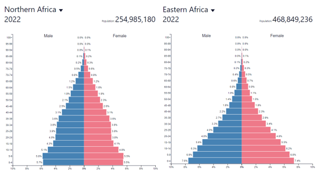
And you could tie this to some language practice, like using ‘whereas’ for contrast. Anyhow, just the use of this for interpreting data is good practice, as I think the need for my learners in KS3 and KS4 to practice interpreting data is a bit understated tbh!
Cross-curricular focus (e.g. Maths)
Well, it’s data, so you can go for some language review in tons of ways. Boring graphy stuff like ‘what does the Y-axis show?’ is still useful, but more so I think the opportunity for rounding:
What was the population of Africa in 2001?
Round the figure to the nearest million.
Etc
Springboard for research
You can ask some good exploratory questions using this data. A good example came from one of my Year 7 Japanese students today. When noticing the projected decline in the Japanese population, he wanted to explain that Japan had an ‘ageing population’. This was a springboard (apart from ‘why might that be?!) into:
- Look at the projected population data for other Asian countries. Do any countries have similar data to Japan?
- Can you find any articles online about the topic of ageing populations in these countries?
Draw attention to / Assess prior knowledge of world events
Language for speculating
What do you notice about the population patterns in these two countries over time?
What do you think caused a decline in the population at those times?
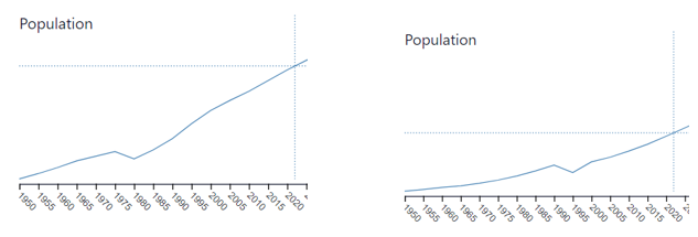
Which countries might be represented in each graph? Explain your answers
(The examples are Cambodia and Rwanda)
You could board process language in this instance:
The graph might represent the population of [country], because…
This could be [country], because…
I’m not sure, but this might be…
I could see this being an activity in, say, Global Perspectives in some context – or the graphics could at least be used to draw attention to the impact of certain events.
Plenty more
Just a few ideas there for starters. I’ve barely scratched the surface, and haven’t even mentioned how easy it would be to use any old graph there for comparisons by gender, age, etc. Presenting data, talking about the past, changes over the past X years (to practice, say, present perfect if you want), etc. Lots of uses.
Plus, if you scroll down the Population Pyramids homepage then there are plenty of other infographics to exploit…
So, what do you do with Population Pyramid, or what would you do with it? Pretty cool resource.
(Thanks Mark Anderson for the inspiration!)
Categories: Lesson Ideas, other

Wow, Pete! You took me back to my IB geography class! (in a positive way, I loved geography 😊)
LikeLiked by 2 people
IB seems super tricky! Must have really set you up for uni studies (if you did a degree) – it seems much more comprehensive than, say, English A-levels.
Glad they were using pop pyramid! Great site.
Incidentally, are you obsessed with Globle too (since the wordle stuff)? That and Wordle Spanish are my new dailies!
LikeLiked by 1 person
When I was a student, I was overwhelmed by the IB syllabus. Now I think about it with a lot of sentiment. Everything about it was great! It helped me a lot, especially with my English studies. I did English as a Second Language in IGCSE, and then I moved up to English as a First Language in IB. It was intense but worth all the tears and sleepless nights 😂
Geography was one of the best subjects in IB. A lot of graph reading. I completely forgot about that.
I did! I have a master’s degree in environmental engineering actually. I don’t use it now, unfortunately, but I try to implement some technical and scientific topics into my English classes.
You know what? I used Worldle a few times, but it didn’t hook me as much as Wordle. I may give Wordle Spanish a go, but I’m afraid of failure 😂
LikeLiked by 2 people