
I’ve been writing a module on gender equality recently. As part of the research, I’ve read (chunks of) the World Economic Forum Global Gender Gap Report 2022:
You can view/download the report here.
I’ll be honest, I hadn’t come across the gender gap report before. Well, it’s the type of thing that might have been referenced in articles I’ve read on the topic of gender equality, but I had no idea that the reports themselves were so comprehensive, informative, well-summarised, and easily available online.
I can see the report being used as a resource with Secondary EAL learners. It introduces content and concepts which are likely to arise in mainstream classes – from Geography to PSHE, Global Perspectives to BTEC Business. The content of the report has the potential to encompass all four dimensions (issues, spatial, temporal, process and pedagogical) outlined in Boyd Roberts’ guiding framework for international education. Also, it can be used for directed activities related to text (DARTS) addressing broad language functions/skills such as analysing and reporting data, comparing and contrasting, scanning for specific information, research skills, and so on.
I’ll probably build a series of lessons around the report (collaborator, you know who you are!). In the meantime, here are some ways you could make use of the report in the EAL classroom:
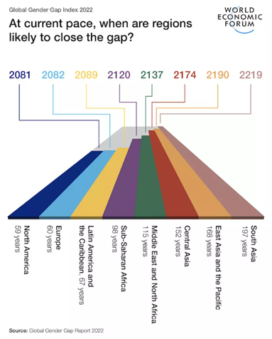
The infographics section
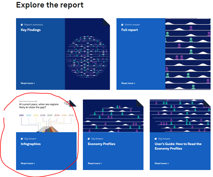
The infographic summaries from the report are an excellent starting point for EAL learners. The text in the full report and key findings is quite complex in parts, so these visuals are readymade support for helping learners access the content.
You could…
- Have learners skim read the infographics and share 3-5 findings that they found interesting/surprising/etc.
- Get learners to devise questions around the content to help them understand more, e.g.
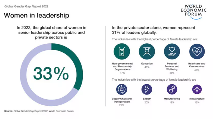
This infographic might prompt questions like:
Why are only 33% of senior leaders in the public and private sector women?
In which countries is the percentage of women in senior leadership above average?
Why are only X% of senior leaders in X industry women?
Etc
Learners can decide the best (and most researchable) questions to form part of a guided inquiry / research task, etc.
- Do prediction tasks for some of the content for learners to draw upon prior knowledge:
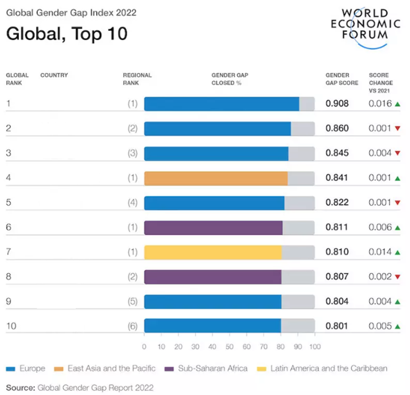
Which countries around the world do you think are closest to achieving gender parity? Explain your ideas. (Hint: use the colour-coding in the above graph to help you).
Then you can build research activities around the data:
Search for online articles about closing the gender gap Norway (Ranked first). Find clear examples of how Norway have closed the gender gap in areas such as:
- academia
- pay
- rights
Or
Norway have introduced various regulation related to gender equality. Can you find examples?
Etc.
(or provide articles as follow-on reading)
- Use the graphs as part of IELTS Writing Part 1 practice (if this is part of your EAL provision):
The graph shows…
Overall…
Etc. You know the stuff. Not all the graphs in the report would work for this, but many would.
The Economy Profiles
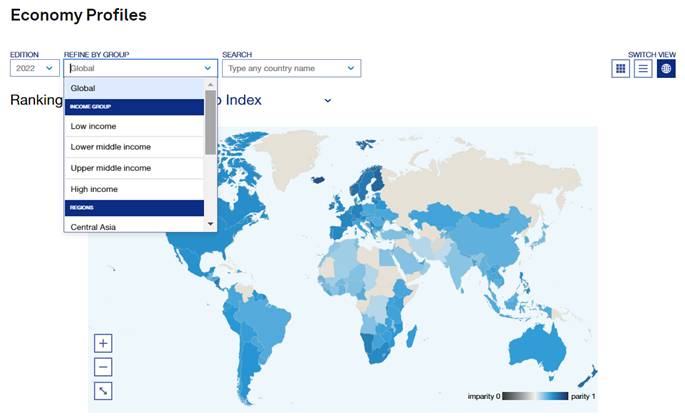
These maps show gender parity across the globe (for the 145 countries that were included in the report) based on a range of different factors. You can show results per income category:
And switch views to tables to make it easier. You could…
- Use these maps to analyse change over time. You can view data for all the previous reports dating back to 2006, and can switch between info from different reports really easily.
- Quickly view data based on subcategories across the four different dimensions. You could easily make a webquest style activity for learners to search for certain info, or have them devise their own quizzes around this data (similar to the Population Pyramid ideas I shared before):
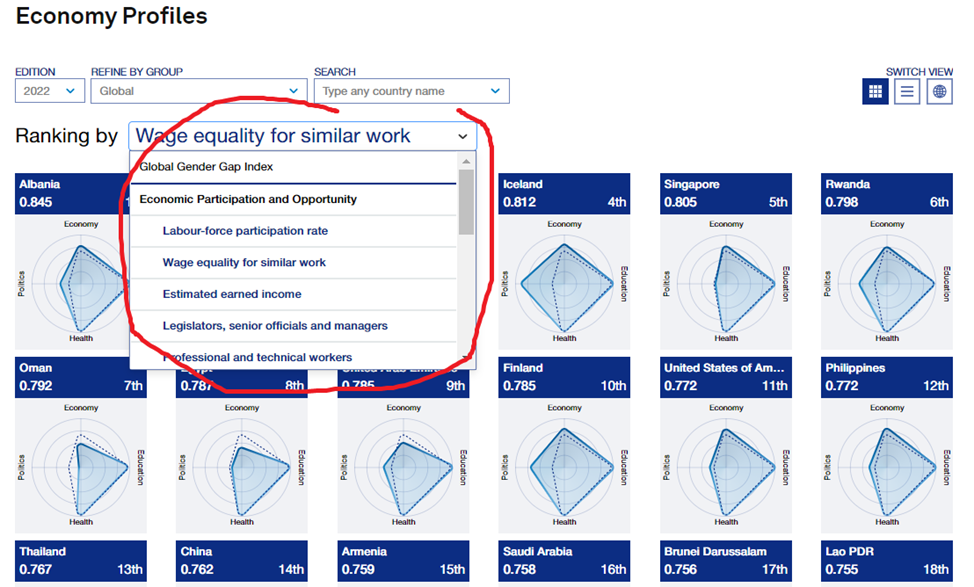
- Use the data as a springboard for further research into female leaders. There’s some interesting data on that:
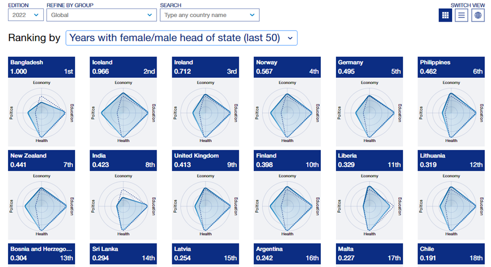
- Use this section to help introduce certain topics that are taught as units in mainstream classes. For example, the Year 9s at my previous school did a unit on access to education around the world. You can quickly pick out data on this, such as parity scores for access to Primary/Secondary and Tertiary education (Secondary is shown):
Anyhow, this section is really worth exploring.
Use the Key Findings summary for comprehension tasks

The intro to the Key Findings, and the ‘Global results and time to parity’ sections make for a useful text. They are full of useful language for analysing data, which can be drawn out. Certain paragraphs could also be used as a model, which learners could compare their own attempted summaries against – there’s an instant WAGOLL there!
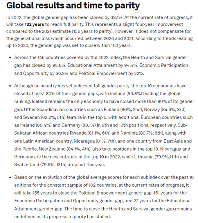
They also lend themselves to one of my favourite tasks – this is answer, what’s the question?
| Question | Answer |
| 22 years | |
| 7th | |
| etc |
Learners scan for the info, then they need to read the context around it to establish exactly what it is referring to. They show understanding by making this into a question (e.g. How long will it take to close the global gender gap for Educational Attainment? 22 years).
Of course, for all the sections I’ve mentioned, personal response tasks would be super important for the learners too.
The Full Report
What does it all mean?
Naturally, I was quite shocked at the data in these reports. However, after ploughing through lots of the data and shaking my head at what I perceived as clear inequality, I then realized that I had no idea what most of the numbers meant and how they’d arrived at these figures and rankings! Ha, Dunning-Kruger…
Anyhow, Appendix B in the full report has all the information you need to understand the figures. I feel like it is worth presenting contextual examples of this before learners encounter the data, so they understand the figures. Or, depending on level, you can give them key snippets from this section (e.g. ‘Construction of the Index’ and have them read and ask questions to help understand how the rankings for each country have been produced.
Guided research questions may also help here. There are also opportunities for some critical thinking tasks too, questions about the reliability of the data, why the parity scores are capped at 1, etc.
Sections that would be particularly useful for critical thinking activities include this paragraph on page 53…
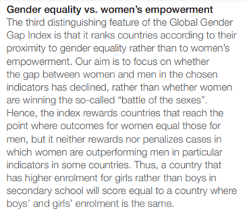
Interesting one for gender-inclusivity there too.
The long list of Indicator Definitions and Sources, which are open to critique (two examples):
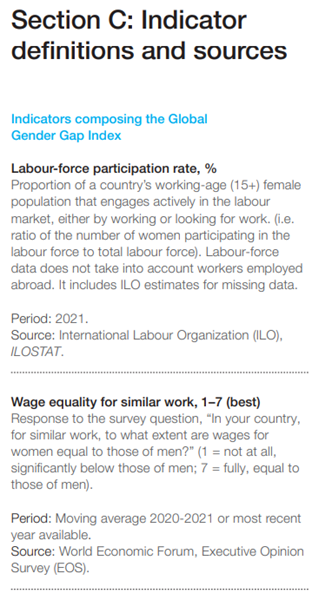
If you’re building a lesson on reliable sources, the methodology and analysis section in the report is worth a look (it’s full of interesting info on the methodology, but also some details that might prompt discussion).
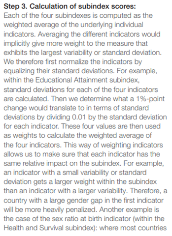
If you are supporting with the teaching of maths/stats, you’ve got some interesting sections in the report to draw upon for that, such as the calculation of index scores (page 55):
Etc, which has got some great examples of key words in context and with clear application.
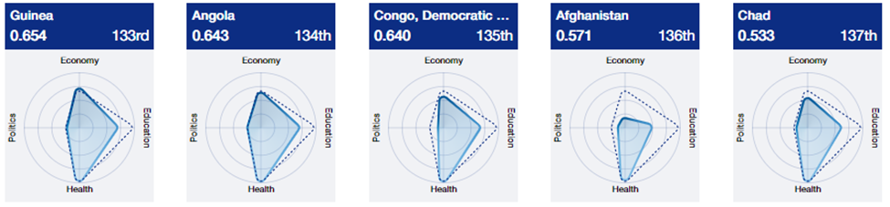
Two-page Economy Profiles
The Economy Profile graphs are excellent, but the two-page summaries of Economy Profiles per country are also really useful. These are great for personalization, relating global findings to the learners’ national context.
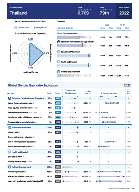
Very useful for project work – identifying areas of development regarding gender parity, researching what is being done, suggesting solutions, and so on.
Of course, context dictates how relevant and useful this document would be for your EAL learners. It is, however, an authentic text based on an important topic, and makes for essential reading for an international educator. I’ll come back with some concrete ideas at some point, but in the meantime… If you do look through this document, I’d love to hear how you might use it in your own context, and the type of activities that you think would work well for your learners.
Categories: Lesson Ideas, other

Leave a comment