
Images in ELT coursebooks are often ambiguous. What might seem a fairly obvious depiction of an act or concept to us may be perceived as something completely different to our learners.
In an interesting, small-scale study, Hewings (1991) asked a group of Vietnamese learners in England to interpret various illustrations found in Elementary level coursebooks. For most of the images correct interpretation would require some culturally-specific knowledge, and written text around the images was removed so the learners weren’t given any support.
Hewings found many types of image were interpreted differently from what was intended. One example was with illustrations portraying people in certain roles, where learners failed to recognise certain stereotypes (e.g. rich/poor). He found, understandably, that culturally-specific job roles (e.g. a priest) were misinterpreted, as were situational images.
Maps like this room plan were also confused…
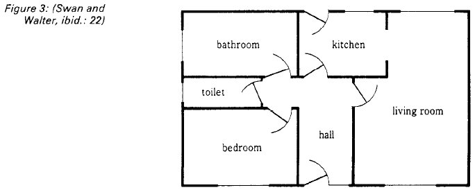
taken from Hewings (1991)
Some learners thought this was a view of a house from top to bottom rather than a floor plan from above. Symbolic representations like thought bubbles were also misinterpreted, and images like the ones below were seen as something different – the first image being a children’s slide, a reception desk, and ‘information’.
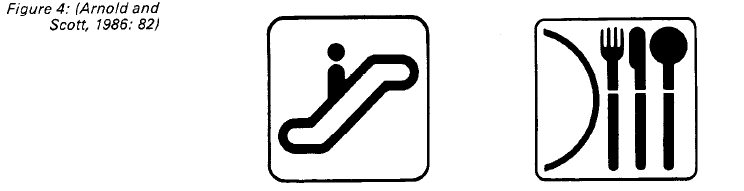
taken from Hewings (1991)
Interpretation of graphs also seemed an issue, particularly dealing with keys.
Hewings made some clear points in conclusion (mostly quotes here):
- ‘we inevitably see illustrations from a culturally based viewpoint…’
- We assume that everyone perceives images in the same way
- ‘We assume that students have the necessary skills to make sense of information presented in the form other than a text’
- Interpretations are unpredictable
- Images are a chance to make learners aware of visual representations of a cultural group/target language
An example from my context
On the whole I feel most of our coursebook images, or those I use in my own materials, are interpreted as intended. However, anything related to emotions and feelings always seems to cause problems. I recently taught an in-house lesson to young learners with a matching task using emoticons, this was pretty disastrous!

Coursebooks such as Beyond (Macmillan) or English in Mind (CUP) use photo stories. It’s always interesting to blank out the dialogue and have learners construct this themselves – this often reveals that learners perceive characters emotions differently.
As a materials writer…
The materials I write don’t include images due to copyright. If they ever do, it’s vector images that appear. The assumption is that these clearly depict certain objects or actions, but I think they are limited when it comes to contexts/situations.
Embracing different interpretations?
Of course I like it when learners share their own interpretations of an image – it would be boring if they all thought like me! Differing views can lead to interesting class discussion. However, it can be an issue if the image has a specific purpose (e.g. establishing a context, representing a target word, etc). According to Hill (in Tomlinson, 2013), that’s not as often as we might think when it comes to coursebook images!
Hill found through analysing various coursebooks that over half their visuals were merely for decoration rather than for a specific purpose…
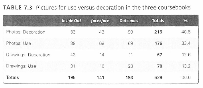
taken from Hill (in Tomlinson, 2013)
This seems like a waste of coursebook space to me. Hill points out that it’s the publishers rather than the writer who would make such aesthetic decisions.
If the images with a specific purpose are likely to be misinterpreted then they must require more careful selection, unless (as with Hewings last point) you want to make learners aware of how a concept might be visually represented by a particular cultural group…
Piloting images?
With all this in mind, I wonder whether images are ever piloted by publishers. I’d assume this is standard practice.
I remember running a psychology experiment once using images to represent items. The images seemed pretty clear to me – a cabin, a cabbage, a crocodile, etc. But before I planned the experiment I still had to run the images by 100 people to check they interpreted the images in the same way. I excluded any images under a 95% match.
You could apply the same process to coursebook images, going beyond concrete nouns and dealing with depictions of a situation, an emotion, etc.
Ah, but I guess there’s a problem. You need the images to be interpreted similarly by your target learners – that’s a pretty broad spectrum if it’s a global coursebook. Publishers could produce localised/regionalised versions of their coursebooks with more suitable images, ones which they have piloted with target learners within the region.
Over to you:
- Do you find your learners interpret images differently to you?
- Is it fair to say that learners ‘misinterpret’ these images?
- Do you feel the images used in your coursebooks are suitable for your learners?
- How do you select suitable images for your own materials?
References:
Hewings, M. ‘The interpretation of illustrations in ELT materials’ ELT Journal, v45 n3 p237-44 July 1991
Hill, D.A. ‘The Visual Elements in EFL Coursebooks’, in Tomlinson, B. (2013) Ed. Developing Materials for Language Teaching. London: Bloomsbury
Categories: General, materials writing

Considering the usual supects – the internet, etc. – I wonder if Hewings’s 1991 study would produce the same results today. I laughed out loud imagining the house diagram from top to bottom – all trapdoors, like a dungeon of horrors! Regarding all those decorative images in coursebooks, I once taught a group of graphic designers who were very critical of the average coursebook layout – so overstuffed with visuals and small font that it it was difficult to make sense of them. Do publishers do user experience testing on coursebooks like you do on a website?
LikeLiked by 2 people
It would be nice to see a more recent version of Hewings’ study. Others may have done similar, do you know of similar research?
Ha! yeah the house plan made me laugh too! Actually there were a couple of other things in Hewings’ article that made me chuckle, worth looking at if you haven’t read it (only short).
I agree, publishers must do some kind of experience testing surely. If they don’t then it explains a lot. We use Beyond for teen classes, have you seen it? One of the most dense, busy coursebooks I’ve used. TINY fonts and gaps too. I bet those graphic designers would be up in arms if they saw it…
p.s. great blog
LikeLiked by 1 person
I am an examiner and I can confirm that maps and diagrams (and graphs) are misinterpreted on occasions. It’s rare but it does happen. I’m not sure it’s always a cultural background issue; there are probably issues with learning difficulties (dyslexia etc) and materials which are not age-appropriate.
LikeLiked by 1 person
This is fascinating to read and a great area to explore. As a coursebook writer (and teacher, and trainer) I’ve pondered both the role and the accessibility of images countless times. I have a lot more to say here (a bit later, when I have more time) but what came to mind in connection with the house plan is a moment from one of my very first lessons, in teaching practice on the CTEFLA at IH London, teaching ‘street directions’ to a very (culturally) mixed group. Of course I used a map, an aerial view of the Shepherd’s Market area, and I was completely caught off guard when some of the students had no idea what the map was supposed to represent. At the time it was an eye-opener and planted a question in my head that I ask every time I choose an image for a lesson.
LikeLiked by 1 person
Haha Steve that is so very true! The advent of Grabbike (moto taxis) combined with google map in Asia has taught me that map reading is definitely a learnt rather than an innate skill!
LikeLiked by 2 people
Yes, a really interesting article. I am also a materials writer and my publisher is always willing to discuss the appropriateness of photos, drawings and – generally speaking – anything to do with layout. We really do appreciate our publisher’s willingness to discuss these things with us and the feedback from students and teachers has been great.
Gender bias and age bias are two more issues that are often overlooked in international publications intended for a wide target readership. The series I have co-authored is aimed at a very local market (Finland) and a specific student population (adult education), so it is much easier to get the graphics “right” when you know your students well.
For example: Cambridge Proficiency coursebooks tend to assume the candidates are high-school students or young adults. I am teaching classes of professionals (lawyers, doctors, teachers) who cringe at some of the pictures (and texts) in these books. I have to spend a lot of preparation time sourcing more age-appropriate (and up-to.date, interesting) materials.
I see a real future in localised, customised materials rather than one-size-fits-all mass-produced publications, precisely for this reason.
LikeLiked by 3 people
Hi Penny, thanks for commenting. It’s great that your publisher discusses the appropriateness of images with you, I hope that’s the case for other writers. You see a future in localised materials, so do I… I just hope big publishers do! I’m pleased that my organisation (British Council) have introduced regional products in the last few years in response to market needs – a step in the right direction, but the ones I write are image-less so not so relevant here!
I’ve come across other criticisms of images used in global coursebooks recently – how they promote certain cultural ideals, perpetuate stereotypes, etc. I guess with the internet we can always find more suitable images for our learners, but as you said that means more prep time for teachers. You’ve noticed gender/age bias – interesting. Any specific examples?
LikeLike
I totally agree with your example, Penny. That’s true for all the exam prep coursebooks that I’ve encountered, at FCE, CAE and CPE. The majority of exam takers may be young adults, but there’s surely a market for adult-themed (you know what I mean) exam prep material. Not all professionals take the BEC, but many adults get stuck with exam prep images and particularly writing tasks that are fit for a teenager. It’s nice that you get to publish materials coherently geared for the audience that acutally uses them!
LikeLike
Interesting research. In my experience, publishers tend to pilot complete units (with images) in target markets, and feedback from teachers on artwork and photos would be included in this process. It’s probably more likely to be teacher focus groups than a full scale pilot, though.
LikeLiked by 1 person
This is very interesting, Peter. Thanks for it! While noting the differences in how images were interpreted seems like fair play for a lesson on its own with students (haven’t we all done something with that emotions type lesson!), what grabbed my attention actually was the table from Hill (in Tomlinson) that you show regarding decorative vs use of images in coursebooks. It’s on my mind as I just a couple weeks ago wrote a chapter for The Image in ELT book (forthcoming) about how learner-sourced visuals work remarkably well (with practice of other literacy skills) in engaging students with readings… and in it I used “decoration-based” and “utility-based” labels for visuals as my own descriptors. Glad to see it pop up elsewhere too. I’ll likely look more into this paper it comes from!
Cheers again.
LikeLiked by 2 people
Interesting read and full of good points to follow up. Thank you –
LikeLike