
Dear Pete,
As author of the book English for Ticking Boxes, we’d appreciate your input regarding the image choice for the front cover. You’ll be familiar with our earlier range of front cover images for books such as…
English for Nostalgic Tourism

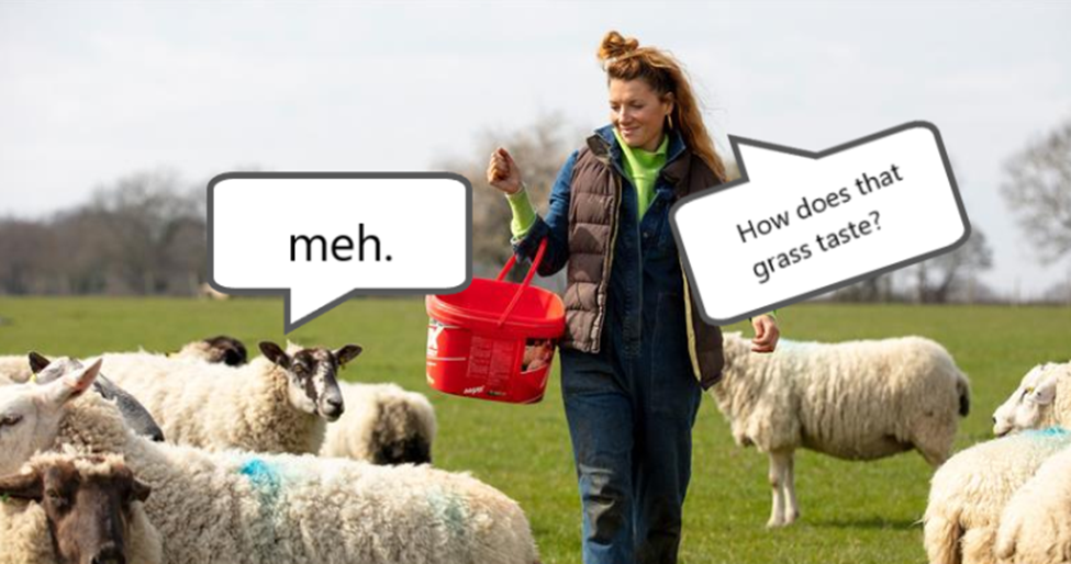
English for Animal Husbandry
and English for actors aspiring to appear in the Highlander movie franchise

We felt that last one was too on the nose. Rather like our choice for English for Personification

Anyway, we are thinking of continuing our recent ‘esoteric turn’, as we did for titles such as English for Kleptomaniacs

And English for Astronauts

Ha, I’m particularly proud of how that one really gets you thinking!
Anyhow, do you have any suggestions?
Yours,
Publisher.
______
Dear Publisher,
English for Ticking Boxes is aimed at learners who want to be able to perform mundane tasks in the workplace which no one will ever review. Those tasks are also ones which jobsworth managers will constantly remind you to complete. With that in mind, couldn’t we just use an image of a typical British Council admin task?
Cheers,
Pete
_________________
Dear Pete,
Copyright. Plus, far too on the nose. Any other suggestions?
Publisher
____________________
Dear Publisher,

Tick boxes, move up?
Pete
_______
Hi Pete,
Just not esoteric enough.
Pub
__________
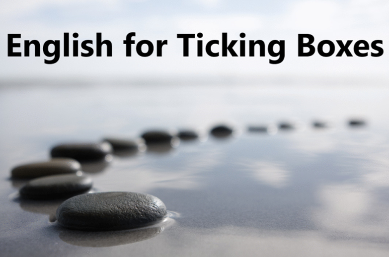
Dear Publisher,
How’s this?

________
Dear Pete,
Okay… I get the ‘progress along a (career) path’ type vibe. A few questions:
- Why start big?
- Why does it stop?
- Why get blurry?
- Smooth pebbles – the right message?
- Will people think ‘pebble dash?’
- Is that Bognor Regis?
- What’s the significance?
Thanks,
Publisher
________________
Dear Publisher,
Exactly.
Pete
_______________
Hi Pete,
Love it!
We’ll get the mock up out on social media soon
Categories: General, materials writing

Leave a comment